— 2min read
🟣 TOOOLS #25: Modeinspect, Brilliant, Hover, VibePrompts, Sliick
|
|

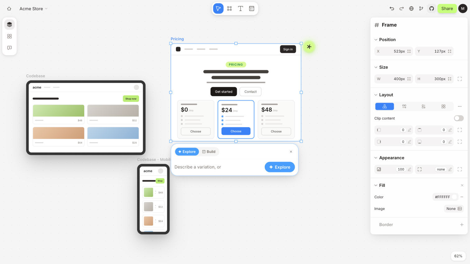 |
| Modeinspect is a design canvas that lives inside your product, so every layout is built from the real components, tokens and live data your team already ships, with the hover, error and loading states included. Pull a live screen onto the canvas, refine it with visual controls, let the AI explore a few directions, and the result goes to developers as a change they can approve straight away. |
|
|

 | A vector design tool where a designer and an AI agent edit the same canvas, producing real editable vectors with design system tokens, syncing both ways with Figma, with a free editor to start. |
 | An open-source set of animated icons built on one shared motion pattern, so every icon in an interface moves the same way and each one stays editable in your project. |
 | A free library of copy-ready prompts for page sections like heroes, pricing tables and dashboards, sorted by section for anyone prompting a layout into existence. |
 | A free browser tool that drops screenshots and recordings into device mockups within adjustable 3D scene templates, exportable without an account. |
|
|

| SMASHING MAGAZINE 📖 ARTICLE The Death of the Button: Why the Best Interface Is No Interface Carrie Webster on interfaces that take a goal in plain language, generate the screen on the fly and run the steps invisibly. Her real question is what the job becomes once the interface recedes: mapping generative components, making the system's interpretation visible, and keeping every action easy to reverse. |
| IBELICK 📖 ARTICLE Julien Thibeaut takes the AI input field apart into eight layers, from the text field to context controls, tool triggers, attachments and the loading, streaming and error states each one has to survive. The component every product is currently shipping, finally documented properly, with a clear case for moving anything non-essential out of the box. |
| APPLE DEVELOPER 🎬 VIDEO Apple's own ten-minute session on the first folding iPhone: why controls move to the outer edges, how sheets and toolbars change between the 5.4-inch outer screen and the 7.6-inch inner display, and why the advice is to design for two size classes and let resizing carry every pose. The clearest answer yet on what the Duo asks of every component library. |
| UX COLLECTIVE 📖 ARTICLE A short history of logos made of data Louis Charron traces more than a century of identities built from real data, from a 1903 Bay Area streetcar company whose mark was its own route map to Visit Nordkyn's weather-driven logo and this year's Adelaide Biennial identity, 109 typeface variations reacting to live environmental data. His case is that a logo which changes when the data changes deserves its own category, and the examples make strong reference material for any generative identity. |
|
|

|
|

| CURATION, BUT MEDICAL “Someone built a properly organised directory of things human bodies do by accident. Filterable by body part, naturally.” |
Demjan was about eleven, carrying his best friend piggyback at recess, when his heart started hurting and he went down. It has a name, precordial catch syndrome, and it is harmless. Bodily Oddities is the catalogue that grew out of finding that out: 155 things bodies sometimes do, filed by region and by kind, each with how common it is. Ear wiggling, about one in five. The urge to jump from a high place, up to 60 percent. |
More Newsletter Issues
All issues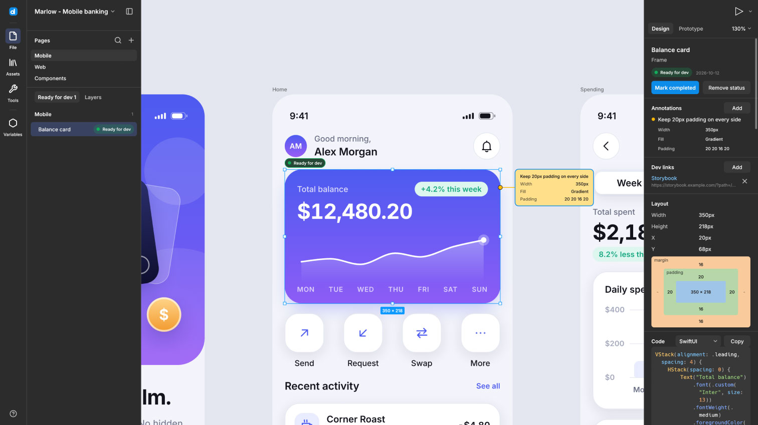
TOOOLS #32: Desigma, Pixlpin, Typebook, Stageshow, Blocks
November 3, 2026— 2min read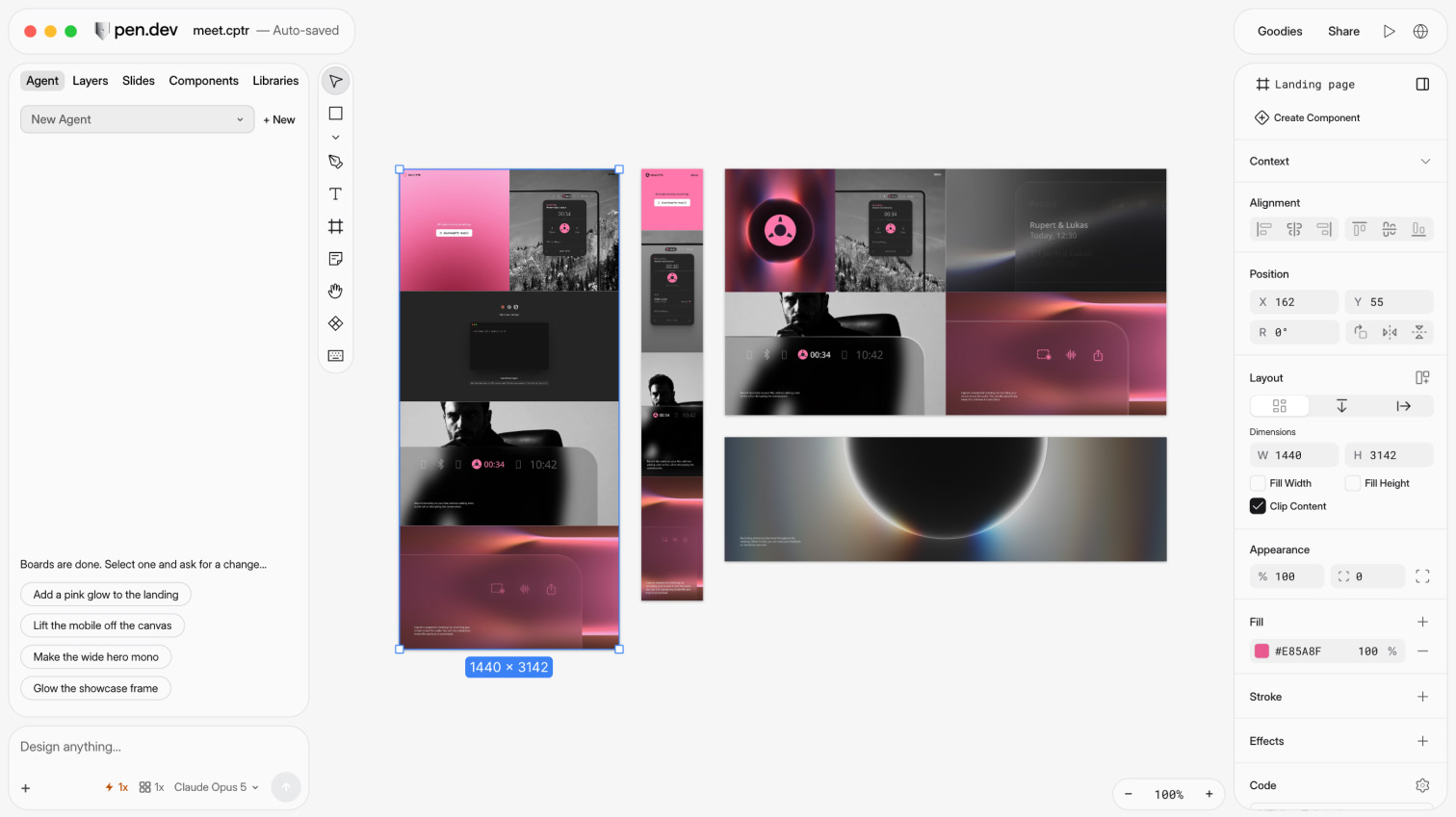
TOOOLS #31: Pen.dev, Design Details, Offgrid, Identik, Fontsight
October 27, 2026— 2min read
TOOOLS #30: Plnty, Ferio, MegaMegaTypeType, EditUI + TOOOLS 2.0 is live
October 20, 2026— 2min read
TOOOLS #29: Voyager, Energy Icons, Leadership Folios, Evil Buttons, Prompt Motion
October 13, 2026— 2min read
TOOOLS #28: PhotoCraft, Podie, Swash, Timeful, HyperFrames Studio
October 6, 2026— 2min read
TOOOLS #27: QuiverAI, Designeer, Squints, Atlas, Lightmeter
September 29, 2026— 2min read
TOOOLS #26: PixelCrew, Bencho, Save.design, Powermove, libraries.dev
September 22, 2026— 2min read
TOOOLS #24: Doop, Causal, Pryzm, Doodle Icons, Neurath X
September 8, 2026— 2min read
TOOOLS #23: Zoah, Book of Shapes, Beautiful UI, All In Frame, vgpu
September 1, 2026— 2min read
TOOOLS #22: Berd, Morphicons, Watermelon UI, Tegaki, Balsa UI
August 25, 2026— 2min read